4.20.2010

Before and After

After a month plus long hiatus, I'm finally back to posting. What better way to start back up again is a little photo-restoration exercise.


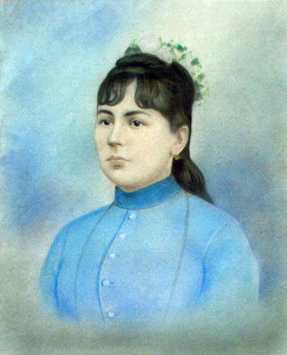
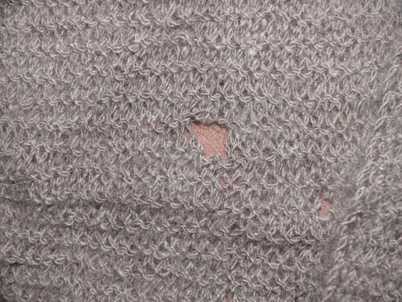
First up we have the original portrait of Ms. Bisabuela. Note the holes, smudges, and wear/aging of the photographed painting, as if a team of moths went to town on the painting. The top right edge has white space, as if it was cut off by the scanner. The overall color of the portrait is lifeless and muted with the little details barely visible, if at all.


Here's what I did... First and for most, I made a copy of the background layer. I have this issue of altering the original image. It's like taking a film negative and adjusting it. But what if you go in the wrong direction? I like to look at it as a form of insurance. Also, it's cool to flip back and forth to see how far you came from the original image.

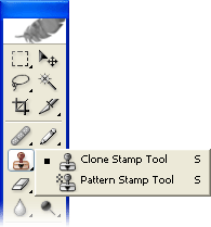
Anyway, I got rid of the holes, smudges, and stains. Plugging the holes is a simple task with the Clone Stamp tool. However, if you're a picky about texture and overall feel, you'd want to go over with the Healing Brush tool. The differences are subtle but well worth it.


Next I adjusted the Levels. I again added another layer, but not a duplication. If you go through Layers off the top bar, you'll see New Adjustment Layer. From there select the Levels option. You'll see a Histogram somewhere (depends if you're on CS3 or 4). You're goal is to adjust each channel (RGB for example) and try to have as much information (black filled graph) between the two tabs on the bottom. After you're all done, it should look like the original graph, but more going more towards the two ends and a bit jagged.


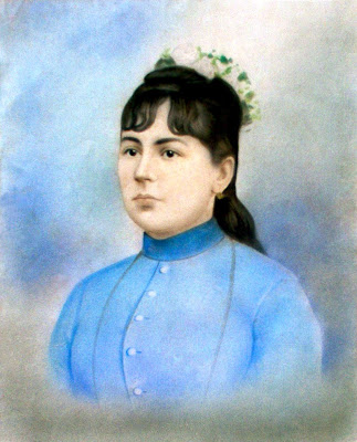
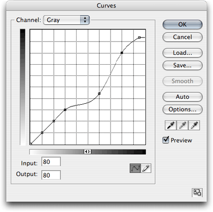
Next up is another adjustment layer called Curves. Add that layer and you'll see a new window that has a line and another graph like setting. You can play with the line and get certain effects. Or you can use the black, gray, and white droppers to achieve the color you want. Use the black dropper on what should be your blacks, gray dropper on grays, etc. You'll notice more lines appear in the main graph box. Keep sampling different areas to get the color you want.

From here on out, you're more or less done. You can add other effects or layers to enhance the image (I added slight adjustment to contrast and brightness). I added a bit of "makeup" for Ms. Bisabuela to make her look younger.

I'm sure there's a videos and tutorials out there. Go play.

3.09.2010

Wanderer Logo

I started to try some stuff in InDesign, but I wasn't quite satisfied with what I came out with. So I started drawing...


While I was doodling, I actually came up with the bottom two first. I wanted to do something like a treasure map or dance steps following the Wanderer lettering. Then I found that a little plain, so I added elements of vacations and traveling. With the bottom one I wanted to simulate footsteps with the letter placement. Also gives it a retro look as well. A friend said it looked like the title to the cartoon Rocko's Modern Life. I can kinda see it. Kinda. The coloring for both I did in Photoshop.

The top two was kinda an afterthought. I started to play with the idea of arrows going everywhere. I then realized the first one was similar to Single Degree of Freedom's CD logo. (Awesome Chicago band by the way! Check them out when you can.) The second I tried to tone down the amount of arrows and give it a more free-flow look. And again, I realized I seen something like this before. This time, it's from the video game Kingdom Hearts, more specifically the level Traverse Town.

2.24.2010

Bonus! Gray Cake sketch

Apparently, I have developed this crazy tendency to sketch out stuff before I attempt it put it through InDesign. Posting the concept behind the finished product seems like a good idea to me, especially when I like the sketch more.


I was aiming to make little geometric ships in battle, originally. Then the idea started to turn into something like the old Japan flag; but instead of shining light, it was taking it in. And rather than the sun, it was this black hole in the form of this archaic, medieval looking seal with little globules floating just outside the event horizon. If only I wasn't lazy and posted this next to the InDesign version for a side by side comparison. Oh well.

I can't wait 'til we hit Photoshop!

2.23.2010

All the wrong fit

One stressful occurrence comes all alone and easy to handle. Then another. Soon, one after many, dozens of them not fitting your life the way you want it. Piling up faster and faster, you're begging for the right piece to fall into place for your life to carry on and it either doesn't come or the opportunity for it to do its part passes...

Sounds like a game of Tetris, doesn’t it?

In this piece I wanted to depict the emotion of stress. The black and white background serves to show the dark, mostly foreboding blocks descending from the Tetris Gods. I tried to stack the blocks in the top left corner as if to show the incoming and foreseeable future one might see under stress. In attempt to balance the composition, I placed this deformed circle/egg-like shape in the opposite corner. As each subsequent block comes into connects with this shape, cracks start to form.

I tried to keep the piece as simple as possible. Also, I couldn't shake the theme out of my head. Are there any other games out there as memorable and stressful as Tetris?


2.16.2010

Gray Cake?

In this black and white composition, I wanted to have the effect of the circles drawing you in. The large, underlying circle serves as an anchor for the composition. I originally wanted the circles to be lighter and more transparent in color, but I feel that having them in a more solid form gives it more substance. As for the "rays of black," I wanted to give that effect of movement spiraling quickly towards the circles.