
While I was doodling, I actually came up with the bottom two first. I wanted to do something like a treasure map or dance steps following the Wanderer lettering. Then I found that a little plain, so I added elements of vacations and traveling. With the bottom one I wanted to simulate footsteps with the letter placement. Also gives it a retro look as well. A friend said it looked like the title to the cartoon Rocko's Modern Life. I can kinda see it. Kinda. The coloring for both I did in Photoshop.
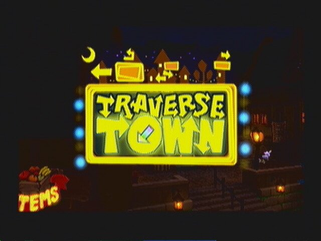
The top two was kinda an afterthought. I started to play with the idea of arrows going everywhere. I then realized the first one was similar to Single Degree of Freedom's CD logo. (Awesome Chicago band by the way! Check them out when you can.) The second I tried to tone down the amount of arrows and give it a more free-flow look. And again, I realized I seen something like this before. This time, it's from the video game Kingdom Hearts, more specifically the level Traverse Town.
No comments:
Post a Comment